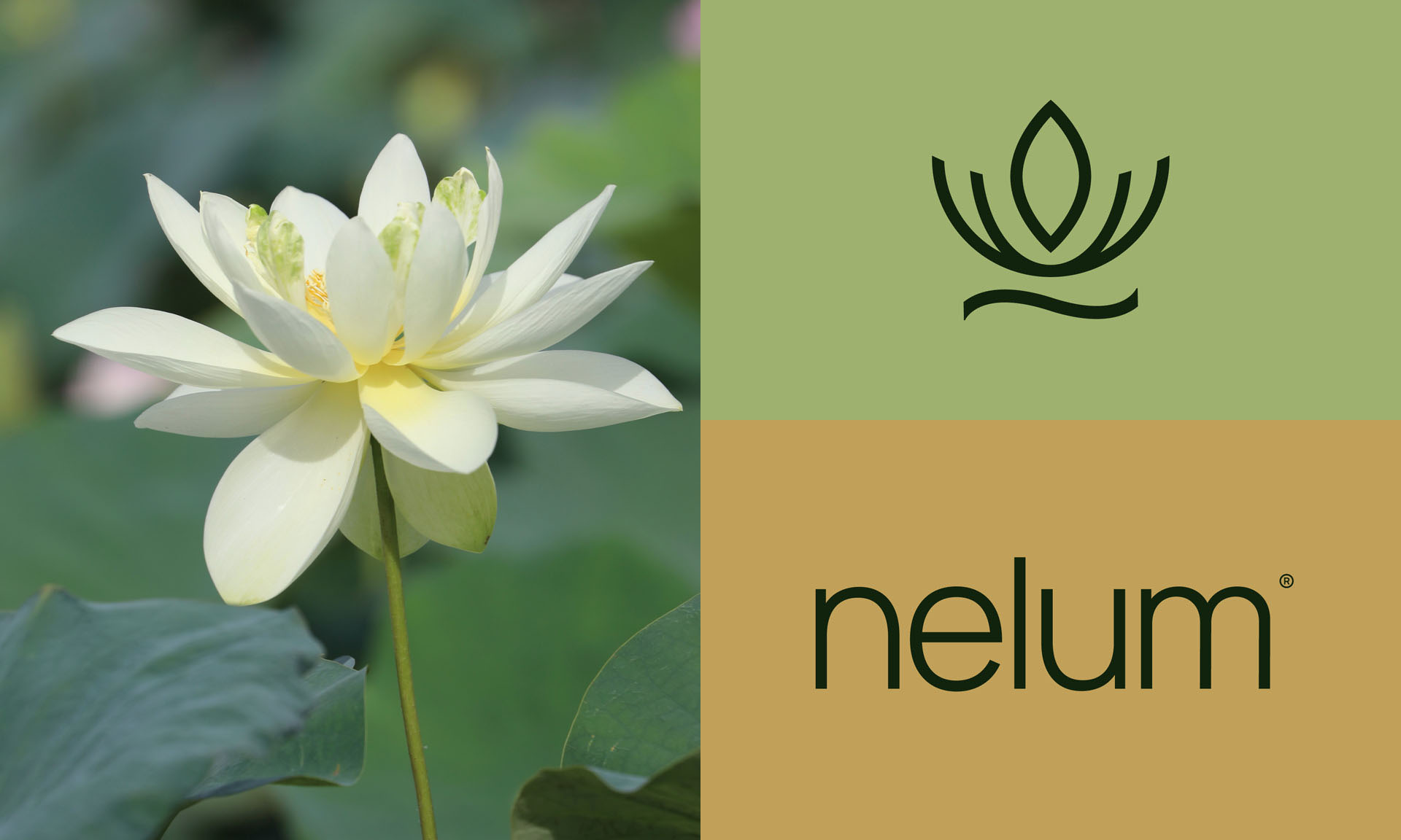
Rebranding Nelum was an opportunity to redefine its essence through a fresh, captivating identity. Inspired by the elegance of the lotus flower, we created a design that seamlessly blends purity, renewal, and natural beauty. The result is a sophisticated yet approachable brand that positions Nelum as a leader in the wellness industry.
Rebrand a dermal therapy studio with an outdated name and a disconnected identity. The aim was to craft a vibrant and harmonious brand that reflects renewal, natural beauty, and a modern, approachable ethos in a competitive market.

We began with the essence of the studio’s vision and values. The name Nelum, inspired by the lotus flower, symbolises purity, renewal, and resilience. The rebrand introduced a natural yet sophisticated colour palette of greens and yellows, evoking growth, vitality, and softness. The elegant wordmark and refined visual elements bring balance and harmony, capturing the studio’s commitment to personalised, non-invasive treatments.
Nelum emerged as a brand that feels as refreshing and transformative as the treatments it offers. The new identity, vibrant yet serene, sets it apart in the wellness industry. A name that resonates with authenticity and a design that connects emotionally, Nelum redefines what it means to stand out with purpose and elegance.
